Digipak Design
Graphic Design, Illustrator and Photoshop
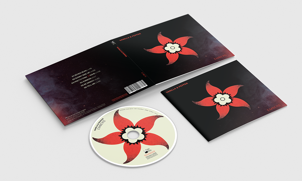
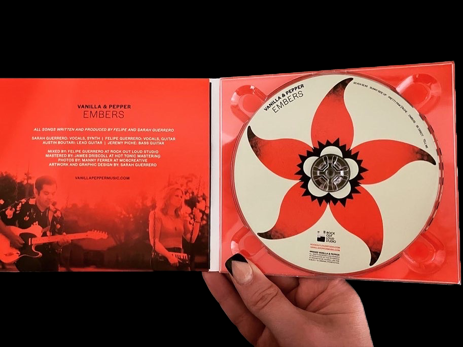
Created a digipak, cd, and booklet design for my Indie/Pop band, Vanilla & Pepper.

Objective
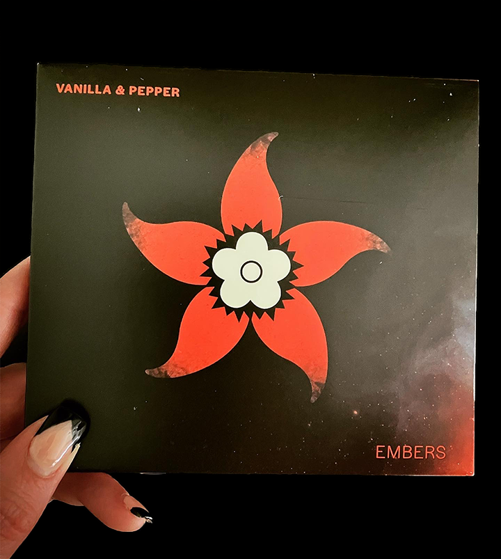
This was the first music album for my indie/pop band and I wanted to produce a strong concept by merging the logo with
elements of the album's title, "Embers." Our music style is very vibrant and energetic and this message comes
across through bright colors and a dark, mysterious edge.
Since this was the first album, I wanted to introduce the logo as the main focus while blending aspects of it with
the album's theme. The charred/burnt edges of the "chilli pepper petals" is a design tactic that signifies the logo as an ember igniting
into the night. This represents a positive message of never giving up on your passions in life.


Again, the back cover repeats the smoke, ember, and red glow idea.
